Her illustrative and design work spans a variety of creative media – from murals to street art, editorial illustration, graphic design, and more. Inspired by fashion, pop culture, and daily life, Emily aims to create eye-catching and visually bold imagery with an element of humor and wit!
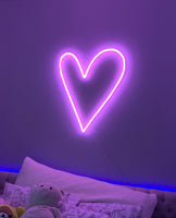
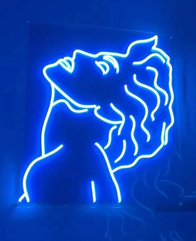
For Yellowpop, Emily Eldridge created a series of sketches - transformed into illuminated signs. The result is a collection of 6 brightly colored LED neon signs!
Learn more about the artist through this interview below:
Who are you?
My name is Emily Eldridge. I’m originally from the United States, but I’ve lived overseas in various countries for the last 17 years! I spent 11 years in Hong Kong, 2 years in Barcelona,
2 ½ years in Berlin, and now I’m back in Barcelona.
What do you do?
I’m an illustrator, muralist, and designer.
Have you always wanted to be an artist?
Yes! I’ve been drawing since I was 3 years old. I was always obsessed with art, cartoons, books, and illustration.
How did you start art?
I studied Illustration at the Savannah College of Art & Design in the United States. When I moved to Hong Kong for work in 2005, I started making small exhibitions there, and began freelancing as an illustrator with clients in my spare time. I slowly started building a clientele, and in 2016 I finally decided to quit my job in Hong Kong and move to Barcelona to study a Master’s degree in Illustration. In Barcelona I started dedicating myself to painting murals and creating street art, and I began to get more work as a freelancer. In early 2019, I finally took the leap to full-time freelancing and working as an artist. Now I create murals, illustrations and other design work for a variety of clients around the world.
You lived in several cities, which one has a significant influence on your art?
I think life in Hong Kong has definitely had the biggest influence on me. It’s a place that still feels like home. The city has so much energy, movement, and life. The colors, food, and culture are so incredible. There’s also so much international influence, and you really have the opportunity to be exposed to cutting edge art, galleries, street style, and innovation, as well as people from around the world. Being around this kind of energy is exciting and inspiring.
What does creativity mean to you?
It’s the ability to express myself without words – a personal language.
Describe your art in 3 words?
Colorful, Graphic, & Fun!
Where do you take your inspiration?
Everywhere, honestly. I look at Instagram a lot, but also love reading magazines, browsing art bookstores, walking around the city, traveling, shopping, and so on. I’m also a huge fan of street art and graffiti. Everything can be an inspiration.
When are you the most inspired?
Visiting a museum or good gallery sparks so many ideas. As soon as I leave a museum, I usually want to go home and paint!
What are you thinking about when you are drawing?
Haha – Life! Existentialism. My next project. Or else what I’m going to make for dinner.
What was your first drawing?
I remember that my mom had a big book about how to draw dogs. And I think at about 3 years old I was drawing pictures from that book, trying to replicate what I saw. That’s the earliest memory of drawing.
With your drawings, what’s the message you’re trying to express?
I love expressing women in a fun and positive way. But I also love creating bold, visual graphics that bring a smile to someone’s face. I want to create something that’s visually appealing and exciting, something that can appeal to everyone.
Colors seem to be very important to you, why?
The use of color is a language too. I love exploring how colors work together, and how they make you feel. A bright color palette really expresses my sensibility.
Why do you draw characters, and especially women?
I guess I draw women because I am one, and it’s a familiar subject. Sometimes it’s an expression of myself or my friends, or a fantasy character who lives in her own world. I think that modern culture is so hyper-sexualized with depictions of women that it’s nice to represent them in a different and unique way.
You also draw on walls, tell us more on why you love it?
Creating murals is like drawing with your whole body. It’s a very physical process, and I love it. There’s also something kind of magical about conquering a space or wall or building that’s so much bigger than you. Creating art that’s 100 times your physical size is empowering and therapeutic. I also love that murals are for EVERYONE to enjoy.
Could you describe your creative process?
Typically I start with a brief from the client, and then think about how I will interpret it. I begin by sketching ideas on my iPad, and once I’ve narrowed down a sketch I like, I start the final art. This is how I create almost all of my illustration and mural assignments. And with murals, I work the same way. Often I have a photo of the building or the dimensions of a space, and work directly with my iPad over the image. This is a great way for me to help visualize what a mural will look like in the end.
Through this process I either create a finished illustration in Procreate or I work in Adobe Illustrator or Photoshop to prepare the files for output.
Why choose LED neon as a medium?
I think LED Neon is a versatile and an easy way to translate my design work into light. Although I love the traditional neon art, it’s also exciting that modern technology allows us to explore a new way of creating these forms.
Why did you decide to partner with Yellowpop?
I think it’s so exciting to have the opportunity as an artist to see your work in a new form. I’ve always been obsessed with neon since living in Hong Kong, where they can be found all over the city. Having the chance to create my own neon designs was a dream come true! Yellowpop was the perfect partner.
What about the process of creating this collection of neon signs?
For this collection, I really wanted to create work that people would like having in their homes; modern and funky décor for the stylish, design-loving consumer. I thought about what I’d personally like to have in my own home, and went from there.
Of course, I also had to include an homage to my beloved Hong Kong with the “Double Happiness” sign, as well as some of my classic female characters.
Tell us more about this collection of 6 neon signs:
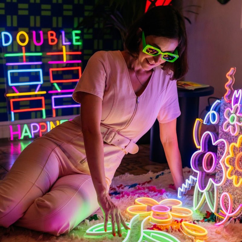
“Double Happiness” is an homage to Hong Kong – it’s a Chinese ornamental design that’s frequently used in celebration and weddings, but nowadays can also be found in home décor and fashion. This piece brings joy and prosperity to any home. Neons are also a huge part of the visual culture in Hong Kong, so I wanted to create my own reference to this.
What about the flower-themed neon signs?
I think flowers make the perfect décor item – they’re funky, colorful, and bold. And they add life to the home. A typical flower bouquet might wilt after a few days, but these flowers last forever!
What about the 3 others?
Of course, as an illustrator, I wanted to create some neon pieces with my iconic characters. These girls are some of my favorites – fun, colorful, and bold! Girl power!
I created the “Shapes” neon to appeal to everyone – something fun and quirky but not necessarily too feminine or childish. I think this works perfectly in any space.


